Flexible illustration system — For AI company o9
This project was all about creating a scalable illustration system for the o9 brand. One that could be easily applied to advertising, motion graphics, and infographics. The challenge was to develop a visual language capable of explaining complex technology while remaining straightforward, and visually easy to recognize. Inspired by the visual environments of traffic signage and road infrastructures in which speed, recognition, and universal understanding are essential.
For me this project was all about combining graphic design rules with illustrative storytelling techniques. I did the art direction and designed the assets together with designer Celine Elsner.
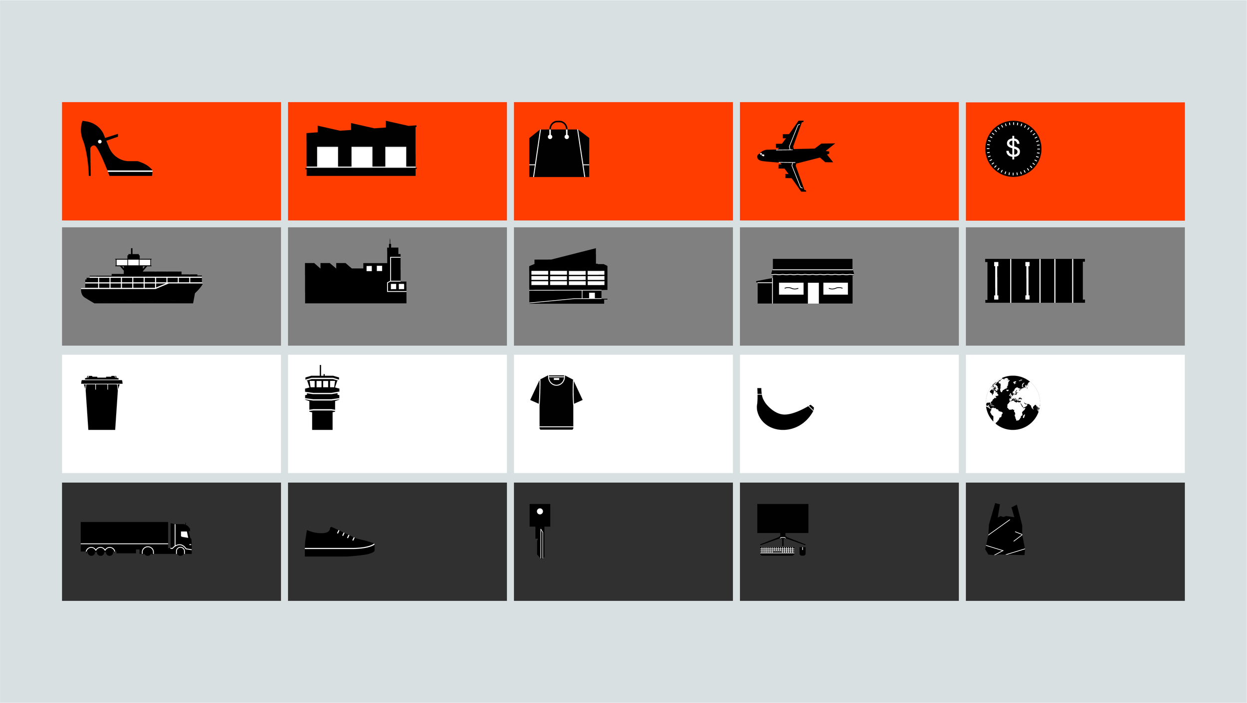
rather than abstract symbols, ensuring immediate recognizability. Drawing from the logic of wayfinding design, the system adopts a practical, utilitarian tone that supports clear communication and pairs seamlessly with terminology-heavy copy. This conceptual foundation creates a visual language rooted in function, clarity, and direct meaning.
Style
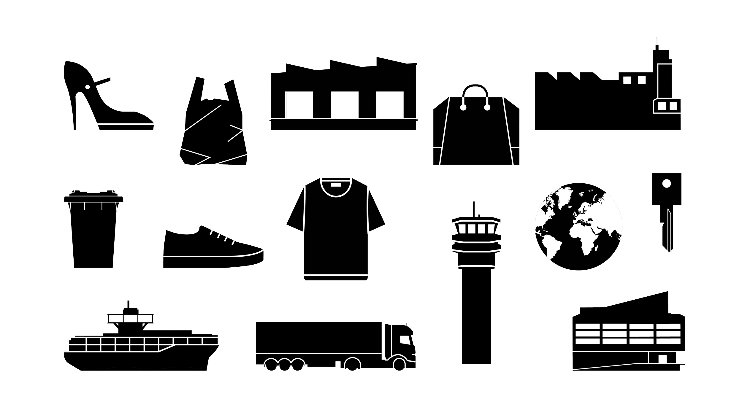
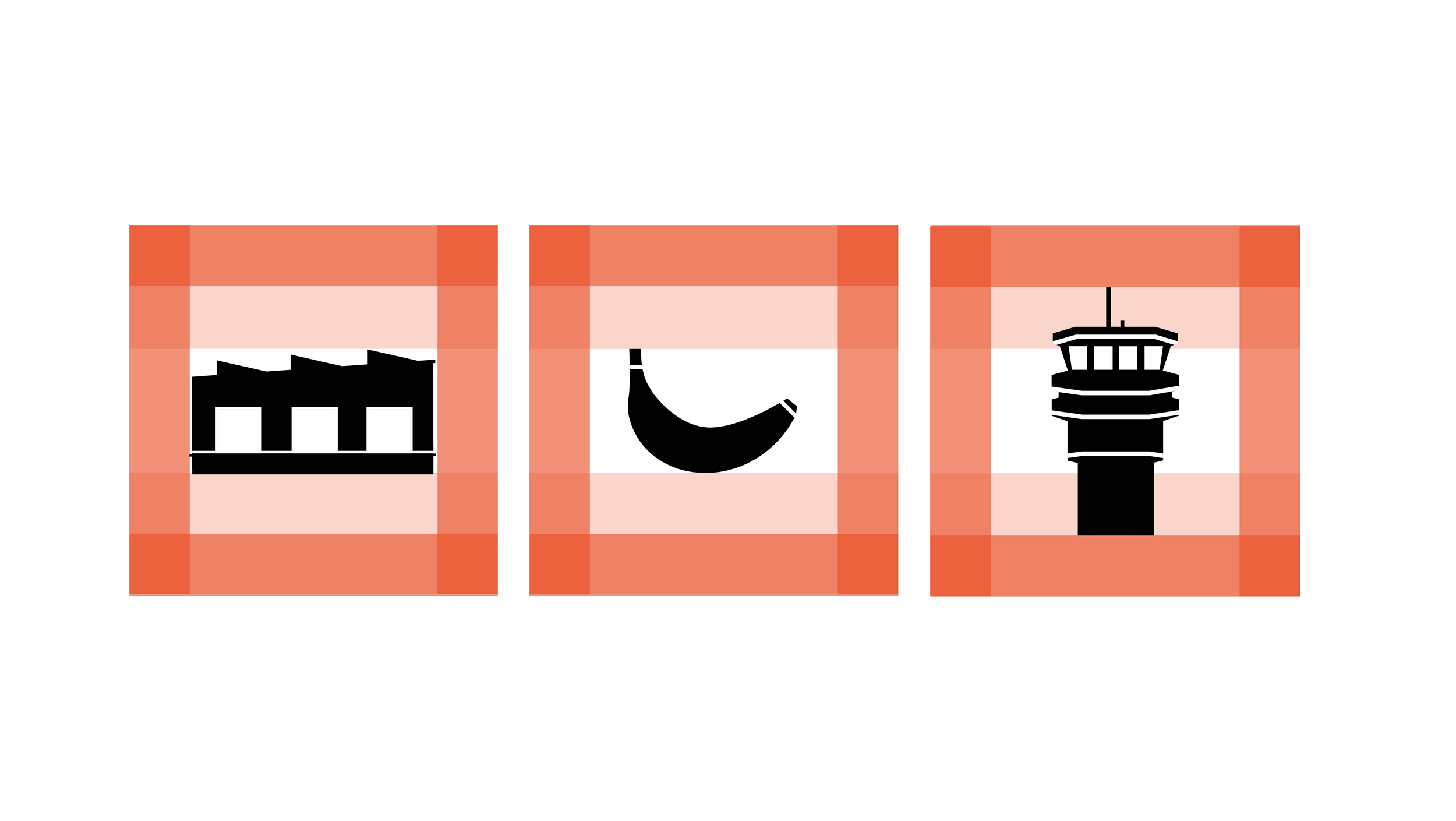
At the core of this system is a commitment to literal representation. Every illustration is drawn directly from real-world objects rather than abstract symbols, making each instantly recognizable. Taking cues from traffic systems in its the dark silhouettes and creating character with the white strokes. This system takes on a practical, utilitarian tone that gets out of the way in service of clear communication and pairs with copy-heavy terminology.
Information and storytelling
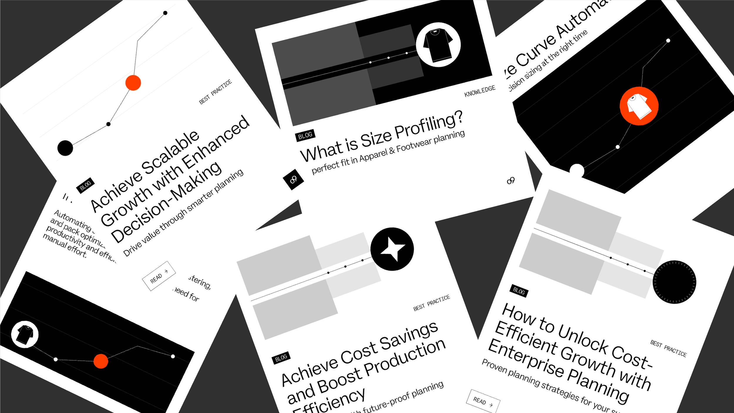
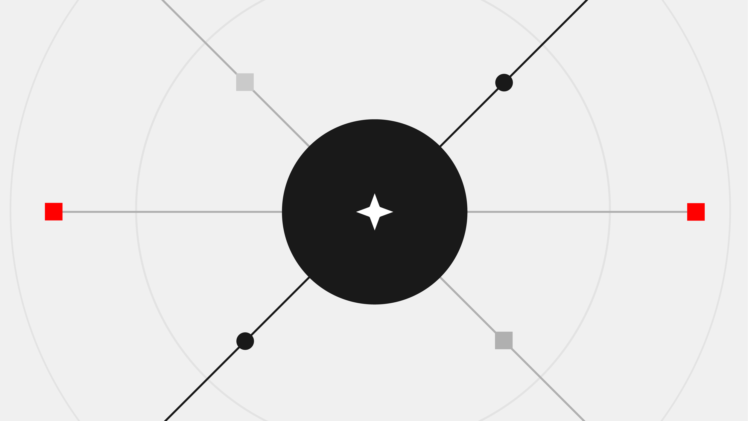
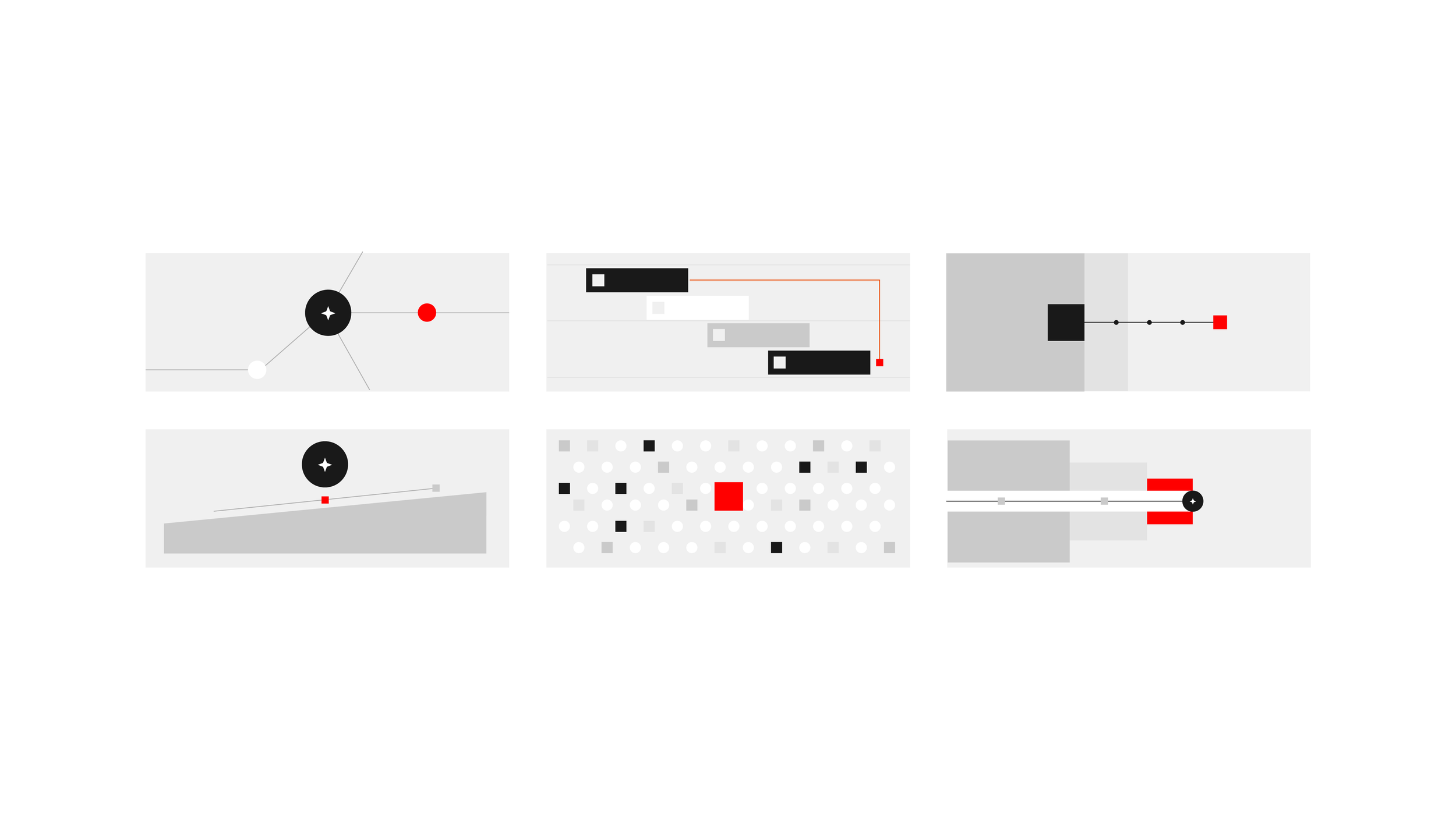
The illustration system was designed as a tool for simplification and structuring of complex Information or narrative. In order to support these complex narratives the literal representations is surrounded by a geometrical environment. These environments can in their abstract composition represents different meanings like “end-to-end” or “shelf time” while still feel like technological. The core branding color is used as the focal point for the meaning or message.
In use
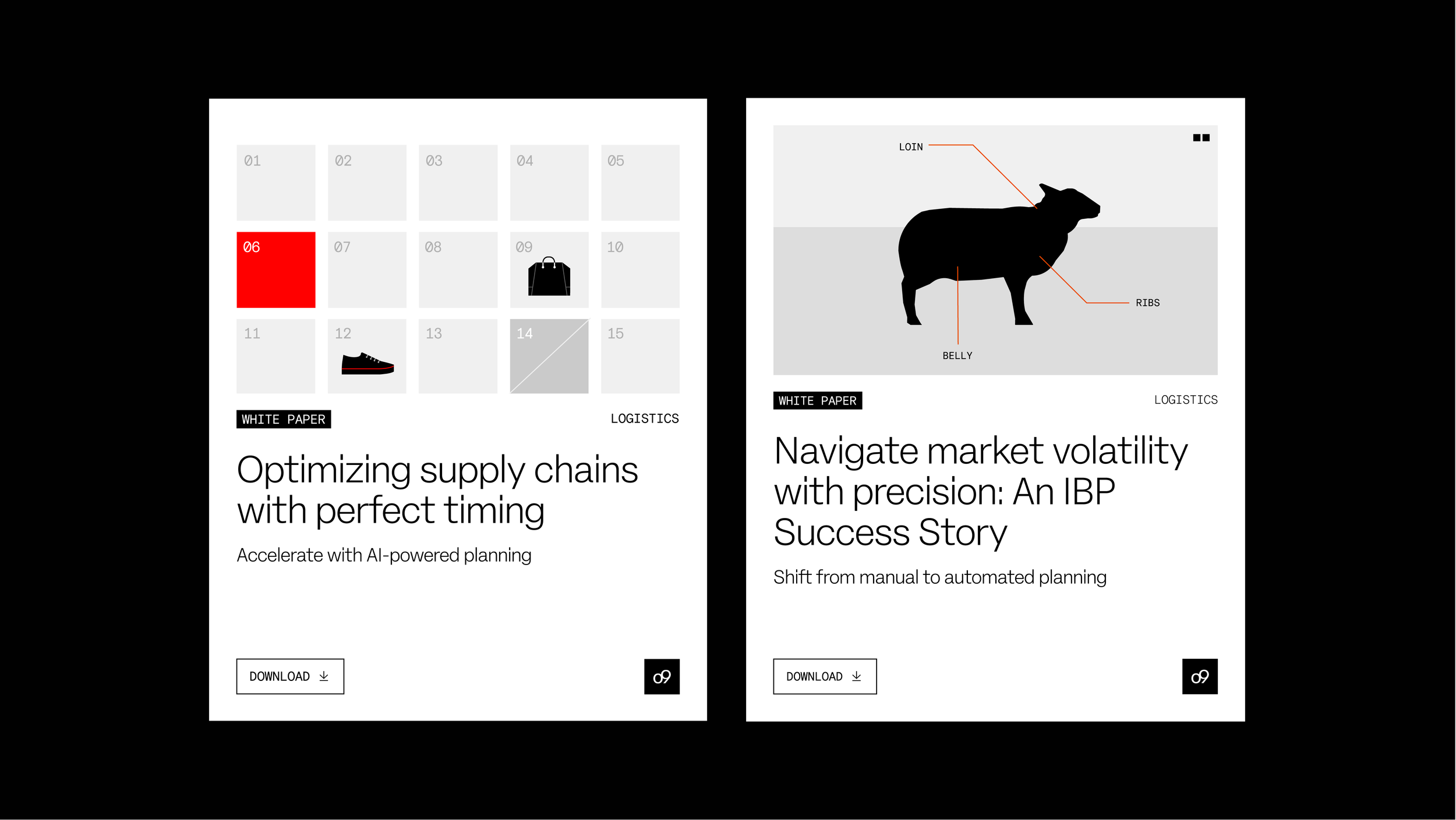
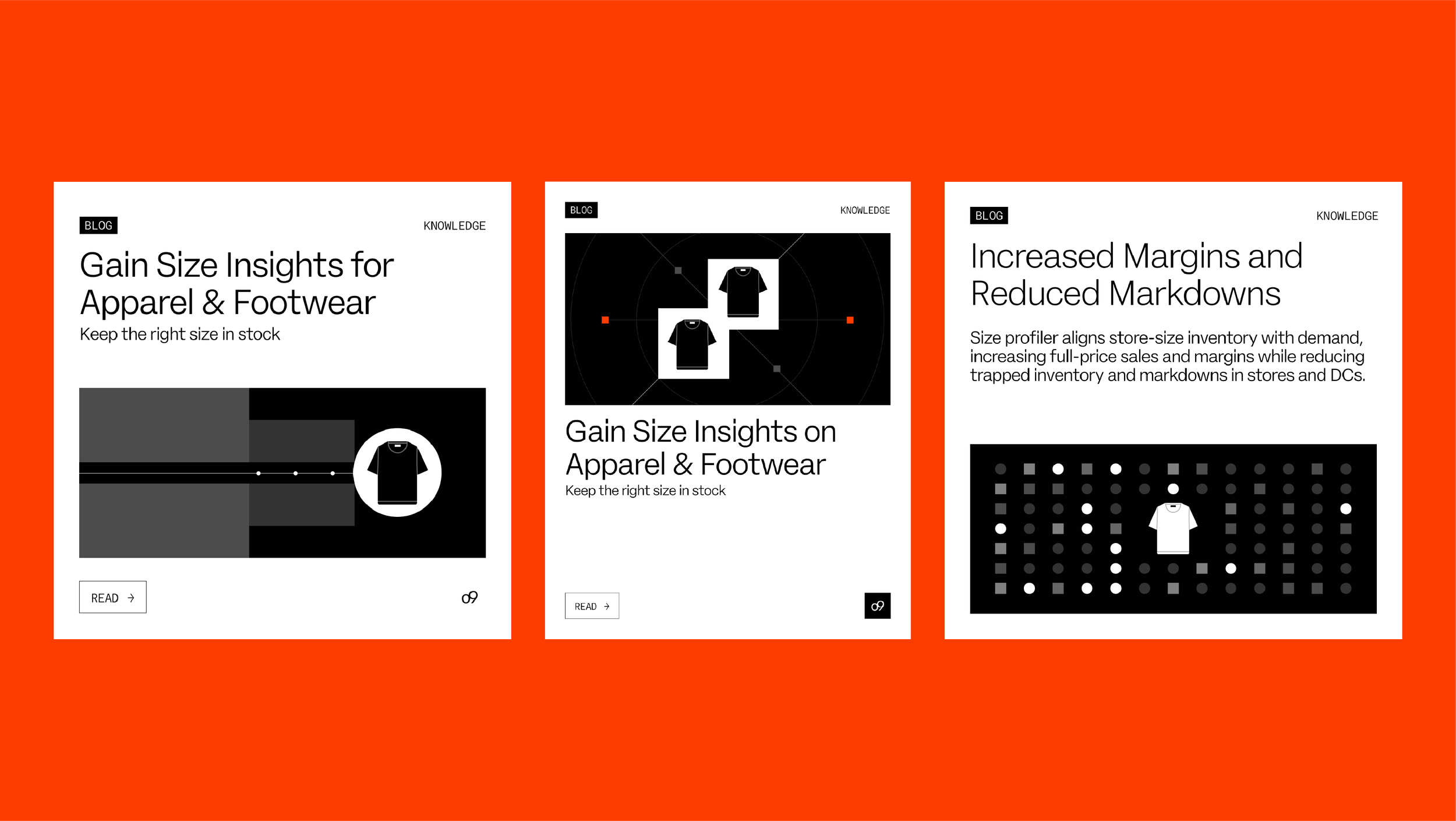
Practice, the illustration system proves highly adaptable across mediums and contexts. It supports rapid asset creation for infographics, integrates seamlessly into motion graphic pipelines, and scales effectively for advertising materials. The geometry is coherent, ensuring a harmonious look in any layout. The familiar real-world cues make the illustrations instantly readable. The system is a reliable framework that enhances clarity, strengthens brand communication, and holds together visual coherence.